Last time, we laid it bare—the quiet ways data visuals can deceive. Skewed axes, dramatic colour choices, and manipulative layouts can twist even honest numbers into misleading narratives. It was a necessary reckoning, because at QuantiSoul, we hold one principle above all: clarity is sacred. Without it, data loses its purpose.
But if distortion is what we must avoid, then what should we embrace?
That’s the journey we’re on now—diving into the psychology of perception and how humans instinctively make sense of visual information. We’ll explore Gestalt principles, pre-attentive attributes, and the ever-revealing Squint Test. At first glance, these terms may sound like dense technical jargon, but stay with me for the next five minutes and you’ll see how something so simple can be incredibly powerful. After all, data visualization and storytelling isn’t just about impressing your audience—it’s about connecting with them. So sit back, relax, and let’s uncover how we, as humans, truly see data.
Gestalt Principles: The Psychology of Perception
Before dashboards and design systems, there was a simple question: How do we make sense of what we see? That’s where Gestalt psychology began—in early 20th-century Germany.
“Gestalt” is a German word that roughly means “form,” “shape,” or “figure,” and it captures a powerful idea: our minds instinctively organize scattered inputs into meaningful wholes. This way of thinking began in early 1900s Germany. The core insight is simple—we don’t just see pieces; we naturally group them to find meaning. Our brains are wired to seek clarity in chaos, and Gestalt principles help turn that abstract process into clear, usable guidance.
When you look at stars, you don’t just see random dots—you see patterns like the Big Dipper or Orion’s Belt. Your mind connects the pieces instantly, without effort. That’s Gestalt at work. It’s the reason a few shapes can look like a face, and why good data visuals feel clear, not cluttered.
The key principles that guide this visual organization include:
Proximity: We group items that are close to one another.
Similarity: We group items that share visual characteristics like color, shape, or size.
Continuity: We perceive lines as smooth, flowing paths.
Closure: We mentally complete incomplete shapes or figures to see a whole.
Enclosure: We group objects that are within a shared boundary.
Connection: We group items that are visually linked.
Figure-Ground: We distinguish a dominant object (the figure) from its surroundings (the ground).
A picture speaks volumes, and when things appear close together, our brains tend to see them as related—even if they’re not. In the left visual, products are listed alphabetically—neat, but meaningless. In the right one, grouping by category reveals the real story: Furniture leads in sales, followed by Apparel and Electronics. Structure turns noise into insight.
When products from the same category share the same colour, our minds start connecting the dots—even if they’re scattered across the screen. But bring them closer and colour them alike? That’s when the magic kicks in. Suddenly, the clutter clears, and clarity emerges in a single glance. And best of all, it lets us compare apples with apples—or apparels with apparels, in this case.
The line chart on the right is a perfect demonstration of Continuity in action. By connecting the individual data points with a single, unbroken line, the visual immediately guides the viewer’s eye along a smooth, flowing path.
Our brains automatically perceive this as a unified, continuous curve (a sine wave), rather than a series of disconnected points. The bar chart on the left, in contrast, shows the same data but as separate, discrete values.
Also, the solid lines between each point in the line chart clearly demonstrate Connection. They don’t just link values—they visually signal that these data points are part of the same story. Even as the values rise and fall, the line binds them into a unified sequence, making the relationship between them unmistakable.

This panda logo is a textbook example of Closure in action. The ears, snout, and body are not fully connected, but our brain fills in the missing parts and instantly sees a panda. That is the magic of visual inference.
Another classic? Pie and donut charts. Just slices, but we see a whole. I did not include those here because I like pies for dinner and donuts with coffee. More on that later.
This visual is a great example of enclosure in action. Each bordered text box acts like a container—wrapping data and story together. It helps the brain break the flowing line chart into clear, digestible chapters, turning complexity into clarity.
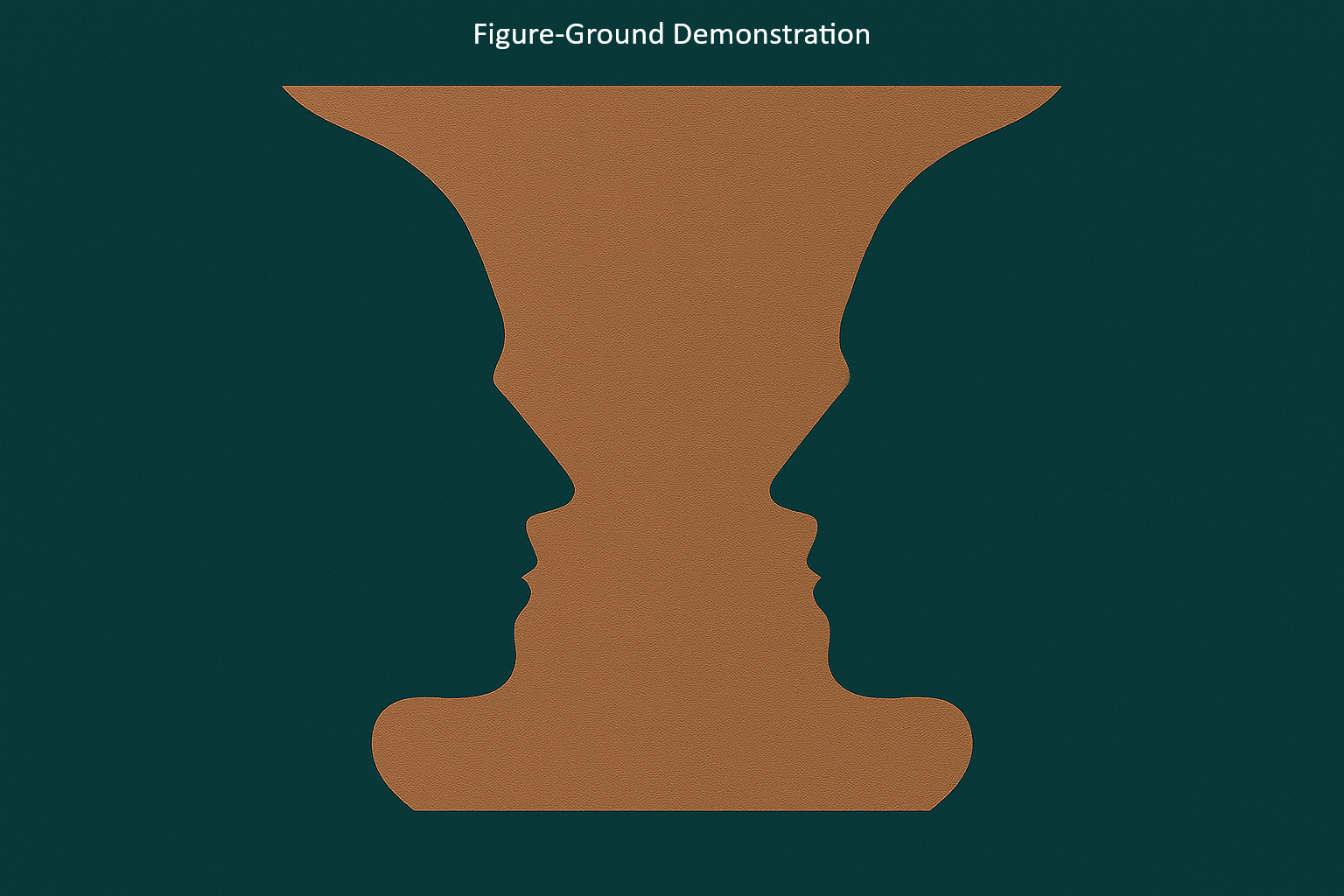
The Figure-Ground principle is our brain’s automatic separation of a dominant object (the figure) from its background (the ground). The classic Rubin’s Vase illusion perfectly demonstrates this: you either see the vase or the faces, but never both at the same time.
In data visualization, the principle’s lesson is to guide attention. Your key insight should be the figure, designed to stand out immediately. If your chart has a cluttered background with thick gridlines, distracting labels, or too many competing colours, the “figure” becomes difficult to understand. The viewer’s attention gets lost in the “ground” and your main message is missed.
Pre-Attentive Attributes

Imagine a scene from a mystery movie. Two strangers agree to meet in a park to exchange something important. One asks, “How will I recognize you?” The other replies, “I’ll be around five feet ten inches tall, wearing a bright red t-shirt, and carrying a rose in my right hand.”
That sounds simple enough. But when the first person arrives at the park, it turns out to be Valentine’s Day. There are hundreds of people dressed in red and holding roses. Confusion follows, with plenty of mix-ups and funny moments.
Now lets leave the fun part apart, and imagine it’s just a regular day. That red t-shirt and rose would stand out right away.
This is exactly how pre-attentive attributes work. They are the things your eyes notice first, like colour, size, or shape. You do not have to think about it. Your brain just says, “Look here,” before you even realize it.
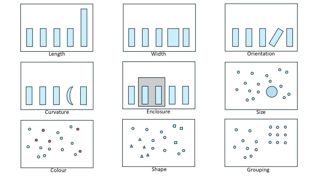
The image above says it all—no need for a long explanation. If I have to explain the effect, then the effect becomes ineffective, isn’t it?
So let’s play a quick game instead. Can you find all the zeros in the image below without any visual hints? Just to make it tricky, I’ve added a few sneaky Os pretending to be zeros. Like wolves in sheep’s clothing. Let’s see how sharp your eyes really are!
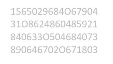
How did you go? Could you find all the zeros? Let’s try this once again, but with visual cues.
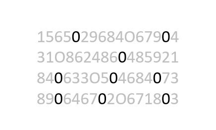
How was it this time—felt easier, didn’t it? For most of us, spotting things gets much simpler once those visual cues show up. They do the heavy lifting before our brain even starts thinking.
Squint Test

Imagine you have just finished designing a dashboard. It looks neat and well structured. You have used Gestalt principles and pre-attentive attributes with care. Everything seems to be in place.
But you still wonder how your users will respond. Will they be able to understand the key message quickly? Can they find what matters most in just a few seconds?
This is where the squint test comes in. It is an informal way to check if your design works at a glance.
This is where the squint test comes in. It is an informal way to check if your design works at a glance. Blur your eyes a little like the “Undercover Teddy Bear” and see what stands out. If the main trend or insight is still clear, your design is working. If everything blends together, the chart might be too cluttered or lacking contrast.
This test helps you check visual hierarchy, colour choices, and layout flow. Try it during design reviews or when choosing between chart types. If the message disappears, consider simplifying the chart, using stronger colours, or adjusting the size and position of important data points.
Applying Gestalt principles and using pre-attentive cues help your charts speak with honesty and clarity. The squint test is a simple way to check if your message still holds when the details fade. If this helped you see charts in a new light, explore other QuantiSoul stories. We go beyond design tips to uncover meaning, emotion, and mindful choices in data. More reflections coming soon where insight meets soul and clarity becomes a quiet form of care. Till then, stay tuned and keep shining!


